Sound Credit Union
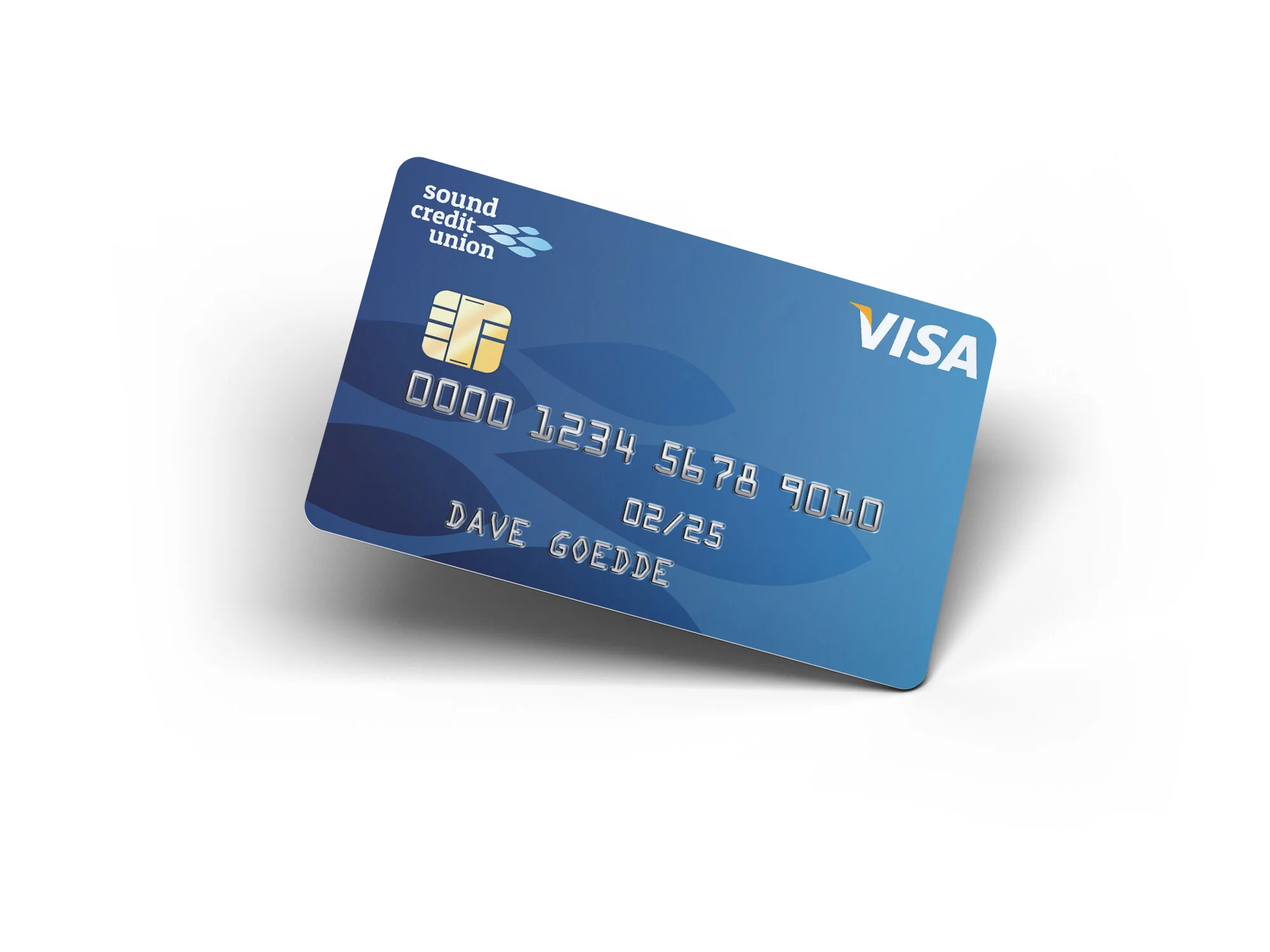
Sound Credit Union needed to refresh their brand to speak to a younger demographic increasingly interested in the value and purpose credit unions offer as opposed to big corporate banks. They also needed a way to stand out from all the other “Sound-”named business that populate the Puget Sound region. We decided to elevate the words “credit union” to the same level as “sound,” making it read more as one complete thought. An updated color palette, friendlier typography, and a new logo that evokes ideas of community and strength in numbers with an abstracted school of fish helps bring a fresh look to one of our region’s most trusted institutions.
Creative Director: Monkey Watson; Associate Design Director: Dave Goedde; Designers: Dave Goedde, Casey Callahan